Soul Care Studio + Sauna
A branding project including illustration, color, hand created typography and more.
Soul Care Studio + Sauna is a wellness spa in Santa Barbara offering the community sauna sessions, cold plunges, non toxic hair care and more. It was important to them to connect to their future clients through branding with a message of warmth and wellness while holding a local California touch.


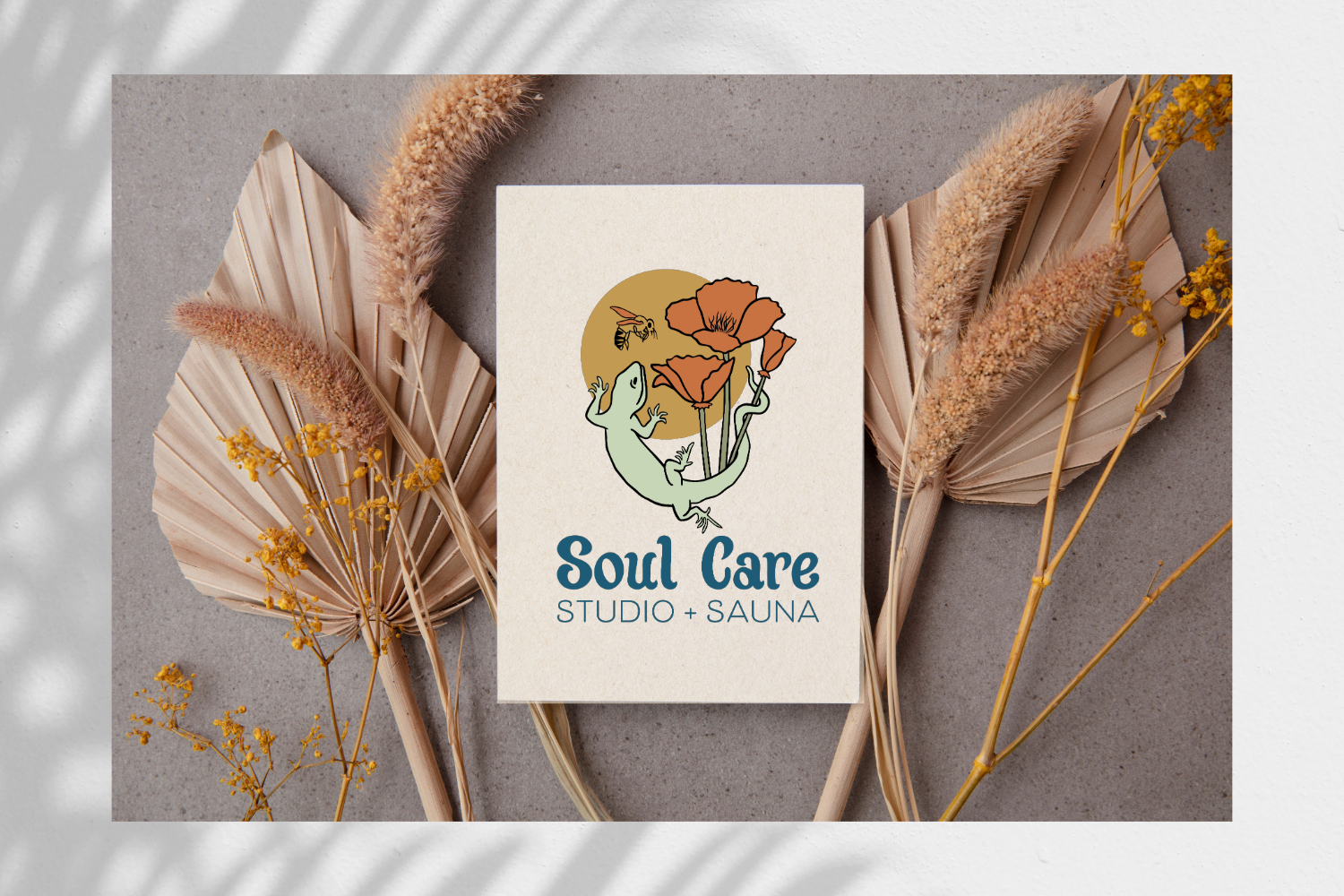
This is the full expression of the logo mark. “Soul Care” is a hand drawn type. The graphic elements are illustrated. We brought together poppies, as the California flower, the sun and lizard representing heat and being drawn to heat for the sauna and the bee is representative of the circle of life.

Personalized graphic elements created a playful, connection to the brand. They can be used together or apart.

The color palette is an inviting, earthy and warm collection plus a simple browser icon and a hand drawn option for Studio + Sauna.


Hand created typography can really add a personalized touch. A big part of branding is being recognized and memorable and a specialized type only strengthens that.